Theory of demand expresses the relation between the price and quantity demanded by consumers at different prices in a given period of time.
What is the Theory of Demand:
Theory of Demand is the economic relationship between the quantity demanded of goods and services that consumers are able to purchase at a given price level.
Consumers seek utility maximization which means satisfaction they derive from consuming goods and services for a given period and paying the price. Different income levels of consumers determine the different quantity of goods demanded to reflect their purchasing power and utilities.
For Example, Consumers from the low level of income may want Mercedes, but it does not add to quantity demanded as because they are not having enough purchasing power to buy it.
Subscribe our Youtube Channel
Terms related to Theory of Demand:
The Theory of Demand is related to the following two terms: –
- The Demand Schedule
- Demand Curve
Demand Schedule:
It is a tabular representation of the correlation between the price of the commodity and quantity demanded for a period of time.
- Individual demand schedule
- Market demand schedule
Individual demand schedule :
It is a tabular representation of different quantities of a commodity at which a consumer is willing to buy at different price levels during a given period.
The following table shows the demand schedule of commodity ‘X’ :
|
Price (in Rs.) |
Quantity Demanded (in units) |
|
10 |
5 |
|
9 |
10 |
|
8 |
15 |
|
7 |
20 |
|
6 |
25 |
As shown in the above schedule, the quantity demanded of ‘X’ increases with a decrease in price. The consumer is willing to buy 5 units at a price of Rs 10. When the price falls to Rs 9, the quantity increases to 10 units. Similarly, as the price keeps on declining, the quantity keeps on increasing.
Market demand schedule:
It is a tabular statement showing different quantities of a commodity that all the consumers are willing to buy at various price levels during a period of time.
Following is the demand schedule of commodity ‘X’ by individual ‘P’, individual ‘Q’ and market demand :
|
Price (in Rs.) |
The demand by Individual ‘P’ ( in units) |
The demand by Individual ‘Q’ ( in units) |
Market Demand (‘P’ + ‘Q’) (in units) |
|
10 |
5 |
10 |
15 |
|
9 |
10 |
15 |
25 |
|
8 |
15 |
20 |
35 |
|
7 |
20 |
25 |
45 |
|
6 |
25 |
30 |
55 |
As shown in the schedule, at price Rs. 10, an individual ‘P’ demands 5 units of commodity ‘X’ whereas Q demands 10 units which result in 15 units as market demand. As price falls to Rs 9, the demand for ‘P’ and ‘Q’ increases to 10 and 15 respectively and the market demand reaches 25 units. Similarly, the price goes on declining and in result, the market demand keeps on increasing.
Demand Curve: –
It is a graphical representation of the correlation between the price of the commodity and quantity demanded for a period of time.
- Individual demand curve
- Market demand curve
Individual demand curve:
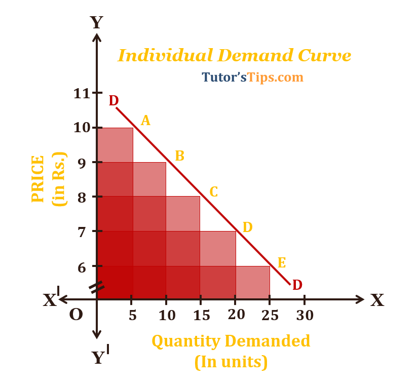
It is a graphical representation of corresponding quantities demanded by an individual of a specific item at different price levels. It is the locus of all those points showing various quantities of an item that a consumer is willing to buy at various price levels during a period of time.

In the above graph, X-axis shows the quantity demanded by the X and Y-axis shows the price. The points A, B, C, D and E show the relationship between price and quantity demanded. DD is the demand curve. At price Rs.10, the quantity demanded is 5 units. As the price decreases to Rs.9, the quantity goes up to 10 units. Similarly, as the price reduces to Rs.8, 7 and 6, the quantity demanded increases to 15,20 and 25 units respective.
Because of the inverse relationship between price and quantity demanded, the DD curve is downward sloping.
Market demand curve:
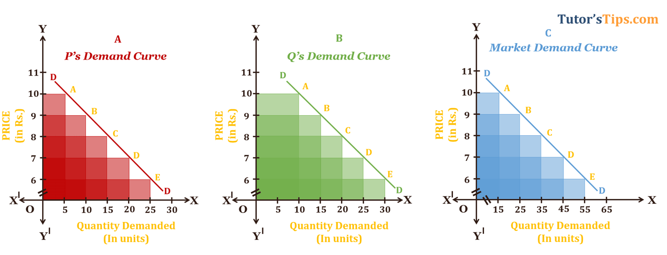
It refers to the summation of individual demand curves in the market. In other words, It is the graphical presentation of the sum total of all individual demand for a specific commodity for a given period of time in the given market.

The (a) and the (b) graph shows the individual demand curve for commodity X by ‘P’ and ‘Q’ whereas the (c) graph shows the market demand for the same i.e. sum of demand of ‘P’and ‘Q’.
In the graph, X-axis shows the quantity demanded and Y-axis shows Price. The points A, B, C, D and E show the relationship between price and quantity demanded. DD curve is the demand curve.
Explanation of graph: –
In graph (a), at price Rs.10, the quantity demanded by P is 5 units. As price reduces to Rs.9, the quantity demanded increases to 10 units. Similarly, as the price goes down to Rs 8,7 and 6, the quantity demanded by P keeps on increasing to 15,20 and 25 units respectively.
In graph (b) for Q’s demand, at the price Rs 10, the quantity demanded by him is 10 units. As the price decreases to Rs 9, the quantity demanded rises to 15 units. Similarly, as the price continues to decrease to Rs.8,7 and 6, the respective quantity demanded increases to 20,25 and 30 units.
Similarly, in the graph (c) which shows the summation of P and Q, at price Rs.10, the quantity demanded is 15 units. As the price diminishes to Rs.9, the quantity demanded in the market increases to 25 units. Similarly, as the price is going down to Rs.8, 7 and 6, the quantity demanded in the market rises to 35,45 and 55 respectively. The DD curve shows the market demand curve.
Thanks Please share with your friends
Comment if you have any question.
References:
Introductory Microeconomics – Class 11 – CBSE (2020-21)


4 Comments